Painting your dining room walls is an easy way to enhance the atmosphere and make a design statement. But the wrong paint color can make the room feel dark, cramped, dated, and less than inviting.
We asked interior designers to share the colors that they would never use in a dining room, with recommendations for shades to try instead.
Neon Colors

Beware of going too bright in a room devoted to enjoying a leisurely meal.
“I would not ever use neon colors in a dining room,” says interior designer Monique Holland. “Visually these colors can invoke feelings of anxiety and overstimulate the senses. A fluorescent color may also reflect onto surfaces and become distracting.”
If you’re drawn to neon shades, Holland suggests incorporating them in small doses. “Use them sparingly either in art and decor, accent furniture, or a light fixture,” she says.
Dull Grays
Holland cautions against using cool, drab grays. “A dull gray paint color can make a dining room look uninviting,” she says. For warmth and a cozy atmosphere, the designer prefers earth tones or natural muted colors, like army green, terracotta, coffee, camel, warm beiges, or taupe.
“Rich tones can improve the room’s energy, encourage conversation, and stimulate your appetite,” Holland notes.
Cold Whites
Choose undertones carefully when opting for neutral white walls. “A stark white color will make a space feel cold and uninviting,” Holland cautions. “The last thing you want is for your space to lack warmth.”
Try a softer off-white for walls and save cool white paint for trim details, she suggests.
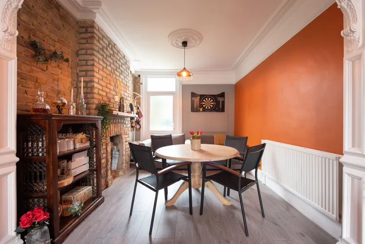
Bold Oranges

Beware of overly bold orange walls, cautions interior designer Tavia Forbes. “Unless you’re going for ‘Halloween dinner party every night,’ loud orange is just too much,” she says. “It can cast odd tones on food and skin, making the space less flattering overall.”
Opt for earthy burnt orange or copper to add warmth in a more refined way, she suggests. Or try olive green for a calming, grounded, versatile option that instantly elevates both modern and traditional dining rooms, Forbes says. “Bonus: everyone looks better in this backdrop.”
Pastel Yellows

Steer clear of pastel yellows that are better suited to a nursery. “Pale, sugary yellows can make a dining room look dated or washed out,” Forbes advises. “They often flatten the look of the food and decor.”
The designer suggests trying deeper tones like ochre or mustard to bring depth and a sense of elegance. Or try timeless shades such as warm taupe or greige that are “soft and inviting while letting your art, furniture, and food stand out beautifully,” Forbes advises.
Bright Blues

Aqua, turquoise, or electric blues can feel too playful and are often better suited to a child’s room or a beach house, Forbes notes.
“They scream beach rental and make meals look oddly unappealing,” the designer says. Choose deep, moody blues like indigo or midnight to create a sophisticated and cocooning feel for evening dining, or soft teal or muted blue-green that has “just enough personality to be interesting, without looking like a swimming pool swallowed your dining room.”
Very Dark Browns

“Heavy, chocolatey browns can make your dining room feel like a dated steakhouse that hasn’t been remodeled since the ’80s,” Forbes says. “Instead of creating warmth, they can read as dull and sap the energy from the space.”
Forbes suggests using lighter, wood-inspired browns or caramel tones to add coziness without feeling heavy. As an alternative, “charcoal or soft black bring the drama without looking like you’re stuck in a time capsule, and they pair beautifully with lighter furniture, artwork, and metallic finishes.”