Choosing the perfect paint colors for your home is an exciting yet arduous task. As it turns out, even interior designers, with their expert eye for color and design, occasionally make missteps when selecting paint shades.
We chatted with three interior design experts to learn about the top paint colors they wish they never used. From unexpected undertones to overwhelming intensities, here are the top paint colors that even the pros wish they’d avoided.
Bright Yellow
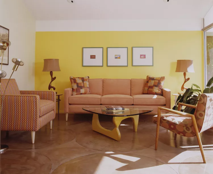
Bright yellow paint may come to mind if you want to brighten a space and add cheerful color. However, designer Cheryl Clendenon says that using this bright hue in her space was a mistake.
“Although cheerful, bright yellows can easily overwhelm a space, especially in small rooms,” she says. “In my experience, it created a harsh, overly saturated atmosphere.”
Clendenon says today she’d choose a muted mustard or soft gold tone instead. These softer hues will still bring that warmth and sunny atmosphere she craved without the vibrant over-saturation.
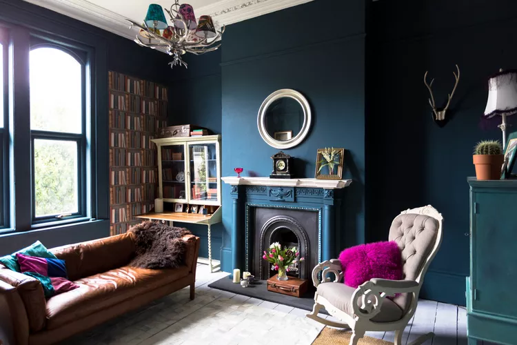
Dark Purple
While dark, moody paint colors like dark purple are officially in for 2026, they don’t suit every space well.
“This one surprised me,” Clendenon says. “I tried it in a bedroom, hoping for a moody, sophisticated vibe, but it ended up feeling heavy and made the room feel smaller.”
Be sure to consider the amount of light your space receives and the feeling you hope to achieve. Dark paint colors are best suited to spaces with plenty of natural light.
In its place, Clendenon opted for a deep, soft mauve paint for a similar depth but with more openness and elegance.
Cool Bluish-Gray
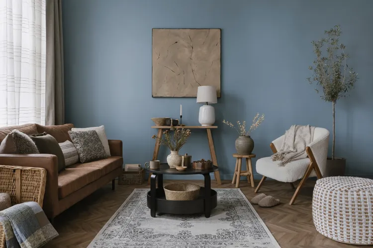
Another color Clendenon regrets using is cool, bluish-gray paint. While this hue can give a space a sophisticated yet comforting feel, it can also come off as cold and sterile, especially in rooms with limited natural light.
She switched to warm greige paint instead, which added the softness and warmth to the space that she was looking for.
Dark Gray
“One big regret was a deep charcoal gray I used in my home office. The color felt oppressive in the morning light, turning the room into more of a cave than a workspace,” says designer Kanika B. Khurana.
Designer Pam Hutter agrees, noting that dark gray can make spaces feel cramped and dreary, particularly in small rooms.
Both designers opted for lighter, warmer tones to replace the dark gray paint. Khurana says she chose a muted sage green for her home office, which felt like a much better fit for a space designed for creativity and productivity, while Hutter says that light grays and soft blues have been her go-to.
Jewel-Toned Teal

Jewel tones can add drama and elegance to a space, but it can also feel overwhelming and oversaturated. Khurana says this was the case when she used an intense jewel-toned teal paint in her dining room.
“I imagined it would feel rich and dramatic, but it ended up overpowering the space, especially at night under warm lighting,” she says. “It also clashed with the artwork I added later, which made the room feel visually chaotic.”
Instead, she opted for warm greige paint on the walls to bring harmony to the space and act as a canvas for the other elements in the room to shine.
Blush Pink
Looking for something soft yet sophisticated, Khurana opted for blush pink paint in her bathroom, which she eventually replaced. Instead, she chose a neutral, barely-there taupe with just enough depth to feel intentional while maintaining a sense of tranquility.
“I was going for a fresh, modern look, but the pink looked too warm and almost peachy in the bathroom’s lighting, clashing with my brass fixtures,” she says.
Mint Green
Hutter says that in her experience, cool-toned green paint (such as mint green) was a mistake. While she was hoping for a bright and energizing finish, in reality, it felt cold and uninviting.
Hutter says she now uses green paint with warm undertones in place of cool-toned greens. Two of her favorites are olive green and sage green. These warmer, earthier green tones evoke a sense of comfort and serenity, bringing the outdoors in and creating a sense of harmony with nature.