Interior design trends come and go, but elevating paint colors tend to stay the same. If you want to give your living room a luxurious look without a hefty renovation, then a new paint of coat will definitely do the trick.
In fact, these five paint colors are interior designers’ go-to shades when they’re trying to create a sophisticated living room for their clients. They’re sure to instantly make any space feel elevated, but if you want more options to choose from, we included a few of their honorable mentions, too.
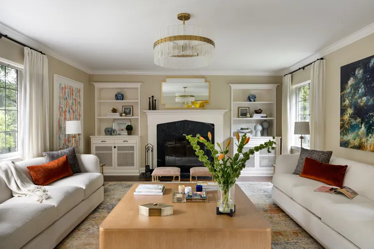
Warm Cream
Your living room’s paint color acts as the base for the room, and there’s no better base color to design around than warm cream. Interior designer Tracy Morris says she loves this color for living rooms because is gives a warm, welcoming glow that feels both timeless and polished.
“It brightens the space without feeling stark, and it works beautifully with layered neutrals or bold accents,” she says. “I love this color because it creates the perfect backdrop for artwork, furnishings, and texture. It quietly supports the design rather than competing with it.”
Olive Green
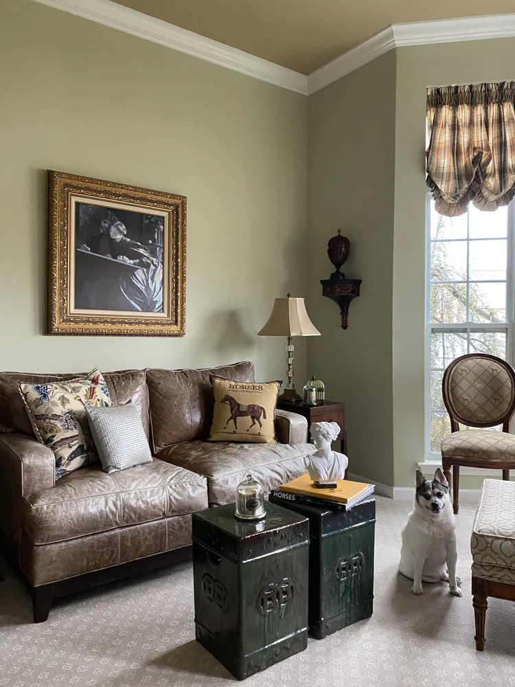
Olive green is another solid living room color choice if you’re looking for a tone that’s earthy but still contains the warming feel of cream. Even though this shade adds a pop of color to your space, it’s still in the neutral family, which means it’s another easy color to fit nearly any aesthetic.
“Olive green adds depth and sophistication while still feeling grounded and natural, ” says Morris. “It wraps the room in a cozy, comforting tone that works beautifully with wood, brass, and warm textiles. It’s one of my favorites because it brings character without overwhelming the space, making the living room feel curated and elevated.”
Charcoal Blue
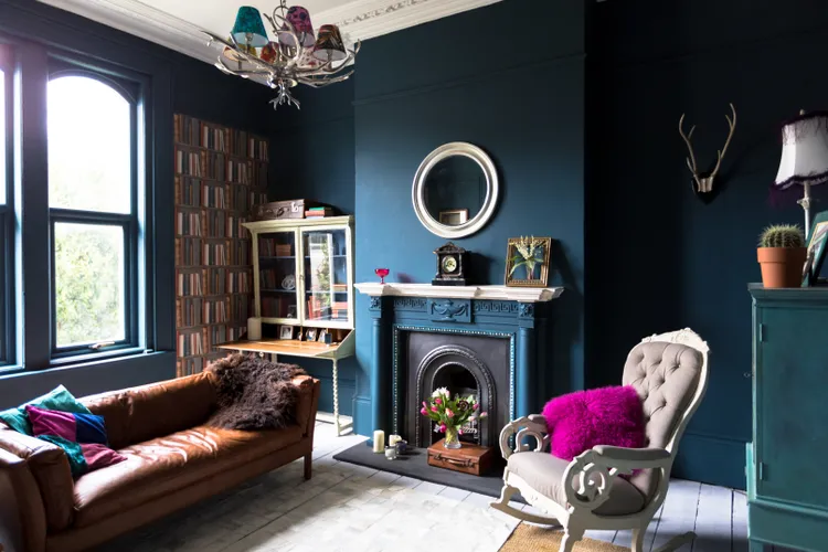
Unless you’re going for a dramatic, bold design to start with, you may feel timid to coat your living room walls in some kind of color outside neutrals.
But, according to designer Anngelica Mohabir, charcoal blue makes a living room feel intimate and architectural.
“It sharpens lines, enriches warm materials, and gives the room a strong point of view,” she says. “It elevates the room by creating a cocoon effect, moody, modern, and deeply inviting. I love it because it makes even quiet furniture choices feel intentional and gives lighting moments this cinematic glow.”
Welcoming Taupe

Taupe and cream share some of the same characteristics of being a soft, airy shade that’s easy to mesh with furniture materials and other colors. Both of our pros say this color is the perfect balance between neutral and richly pigmented. They also say it’s one of the most versatile shades that pairs effortlessly with creams, charcoals, woods, and modern accents.
Mulberry
An interesting color Mohabir says you should paint your living room in is mulberry. This rich color looks luxurious and is the shade for creating a moody backdrop that she says anchors a living room, adds sophistication, and makes textures like velvet, linen, and boucle look instantly more luxe.
“Mulberry is the color for someone who wants their living room to have presence, moody, dimensional, and unapologetically rich,” she says. “It elevates the space by bringing in warmth and drama at the same time, almost like the room has a pulse. I love mulberry because it makes a space feel designed, not decorated; it has that editorial, New York edge.”
4 Other Colors to Use
Because our pros gave us a ton of gorgeous elevating color options, we couldn’t stop there. Here are four honorable mentions for living room paint color that add a touch of sophistication to your home.
Dusty Blue
Dusty blue is basically the lighter version of charcoal blue. But, Morris says its classic appeal is what makes it a top pick for an elevated living room.
“Dusty blue brings a calming, serene energy to a living room while still offering enough color to feel stylish and current,” she says. “It elevates the space by creating a soothing backdrop that highlights natural light beautifully. This shade is a favorite because it feels classic, fresh, and just a touch unexpected.”
Goldenrod Yellow
Yellow might in the living room might have you raising your eyebrows, but this color isn’t like the yellow you’re thinking of.
“I love goldenrod because it shifts with the day, glowing at noon and warm and ambient at night,” says Mohabir. “It’s great for expanding a living room visually and and creating a sense of openness without overwhelming the space. It can elevate a space by flooding it with vibrancy that still feels grown and refined.”
Charcoal Gray
Other than cream, gray is the ultimate neutral color to use for living room paint. Morris says this shade adds drama and elegance without overwhelming the room, while also elevating the architecture.
“It makes trim and furnishings pop,” she says. “It also creates a moody sophistication that feels incredibly modern. I love using charcoal in living rooms because it transforms the space into something layered, intimate, and deeply chic.”
Jewel Green
If you want the look and tone of mulberry but within the green family, then jewel green is the shade for your living room. This warm green is rich and luxurious that Mohabir says makes designing the rest of the space feel effortless.
“It elevates a space by creating instant depth, like the walls are wrapping you in color that feels both artistic and architectural,” she says. “I love it because it’s bold without being loud; it turns a living room into a place that feels curated, collected, and luxurious without trying too hard.”