
While designers are known to experiment with a wide range of paint colors, they also aren’t afraid to play favorites every now and then. We wanted to know—what hues do the pros swear by time and time again when working on a wide range of different rooms?
Here, three interior designers chimed in regarding six of the paint colors that they rely upon often because they work so well in a wide mix of spaces. One thing to note up front? These colors are all whites and off-whites, proving that the hue is a classic and can truly shine anywhere, no matter a client’s style or design preferences.
Sherwin-Williams Origami White (SW7636)
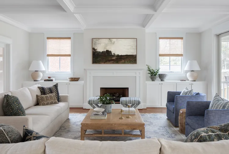
Marya Karlton, the founder of Karlton Kelly Interiors, has been happy with how Sherwin-Williams Origami White (SW7636) has functioned in the spaces she’s designed.
“It’s a really nice soft neutral, so it works well with both warm and cool colors,” she says of the hue, which she describes as being in between a light beige and a warm gray.
Karlton recently incorporated this paint color all throughout a client’s home and notes that it looks beautiful in many different exposures.
“It’s a nice choice for anyone who wants that feel of a light airy house but doesn’t want the starkness of going all white,” she says.
Benjamin Moore Dove Wing (OC-18)
Benjamin Moore Dove Wing (OC-18) is another reliable off-white that Karlton swears by for her projects. She appreciates that it isn’t stark white but also isn’t too yellow in color due to its cream undertones and touch of gray.
“It makes the room feel cozy with its warmth but still clean and not dingy,” she says.
Having used the color in rooms with both warm and cool colored textiles, Karlton is pleased to say that Benjamin Moore Dove Wing is a consistent winner. She also notes that it could be paired with a brighter white colored trim if you wish to add some contrast to a space.
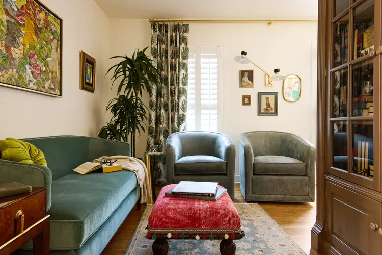
Benjamin Moore White Dove (OC-17)
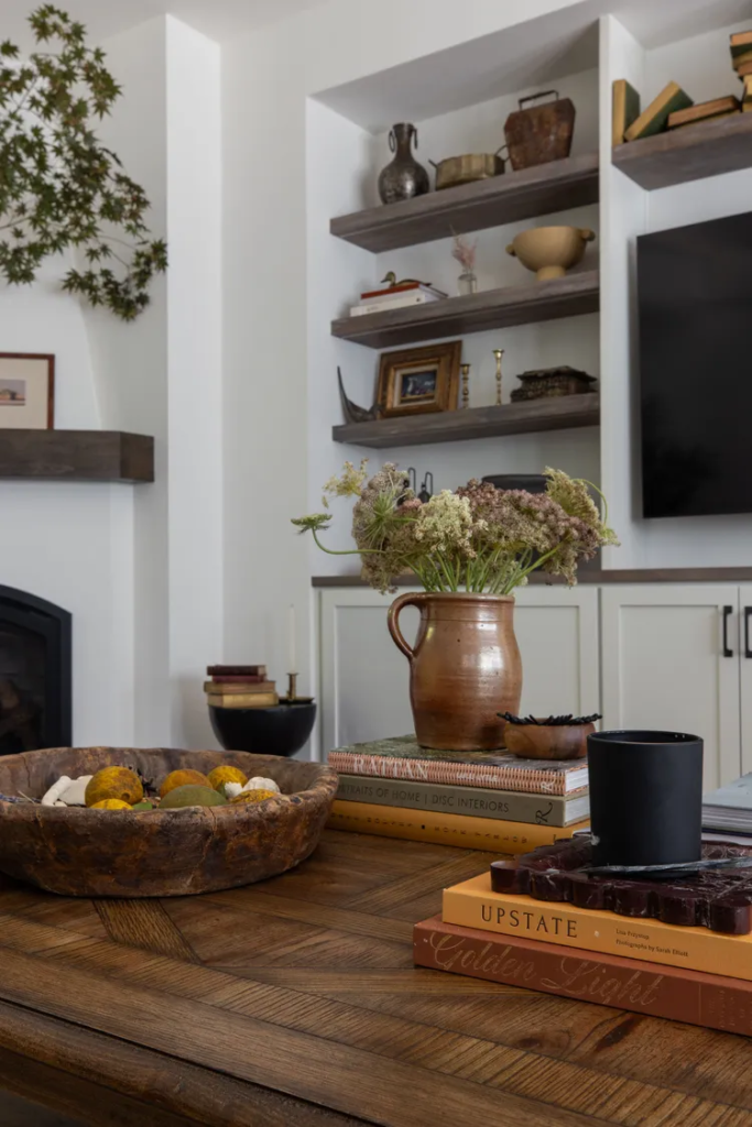
Not to be confused with the aforementioned color Dove Wing, Benjamin Moore White Dove (OC-17) is another versatile designer favorite that Lisa Simopoulos, the founder of Simopoulos Designs, says is “simply one of those rare whites that works across so many different styles—a lifesaver in a world where getting white right can be frustrating.”
In this living room, the white backdrop allows warmer accessories to take center stage, and the wooden open shelving adds a touch of drama.
Benjamin Moore Pale Oak (OC-20)
Simopoulos is also eager to share her appreciation for Benjamin Moore Pale Oak (OC-20). She describes the shade as a taupe that reads as white and can either appear warm or cool depending on what surrounds it.
“While I love exploring options, sometimes the smartest move is choosing what you know will deliver every time,” says the designer, who has incorporated the color into bathrooms, bedrooms, kitchens, game rooms, and beyond.
Benjamin Moore Simply White (OC-117)
Ayten Nadeau, the founder of i-TEN DESIGNS, refers to Benjamin Moore Simply White (OC-117) as a color that is “deceptively powerful.” She finds that it pairs wonderfully with both neutral spaces like kitchens as well as more colorful, pattern-filled rooms.
“It adapts seamlessly, highlighting each design choice while maintaining its own clarity and elegance,” she says.
Farrow & Ball School House White (No. 291)
Nadeau says that she turns to Farrow & Ball School House White (No. 291) when warmth and timeless softness are the goal. What makes the shade stand out to her so significantly?
“It’s a deliciously warm white that feels timeless, soft, and lived-in,” the designer says.
She is particularly a fan of weaving School House White into open floor plans, finding that it can assist with the transition between one space and another.
“It complements natural wood tones and warm finishes, while setting an inviting, elegant tone throughout,” Nadeau says.