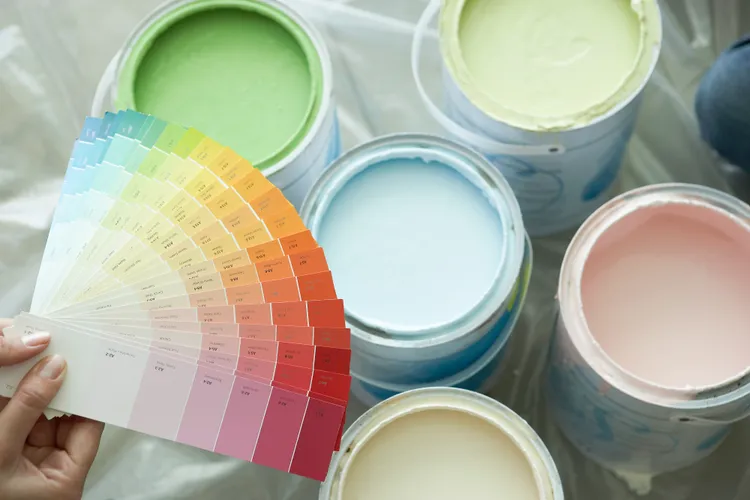
Paint colors can significantly impact how a room feels and looks. And while some hues might make a room feel more airy and bright, others can do the opposite, transforming an otherwise sprawling room into a stuffy, unwelcoming space.
Ahead, we share all the paint colors that render a room feeling and looking stale, and why, with the help of interior designers knowledgeable in color theory and color rules.
Deep Burgundy
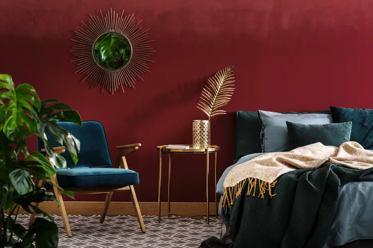
Though a warm hue with plenty of colors to accompany it, deep burgundy tends to absorb light rather than reflect it.
“This is especially true for the color if it has flat or matte finishes,” says Carmen Henriquez, interior designer at BoConcept.
Overly saturated or “muddy” earth tones, such as a deep burgundy paint hue, can make a space feel smaller and darker because they absorb too much of a room’s available natural light. Thus, when used in a room without ample windows, this color can make the walls feel like they are closing in, creating a cave-like and confined sensation instead of a cozy or dramatic one, she says.
Especially if you’re working with a smaller space, burgundy can make it look and feel smaller than it actually is.
Cool Beige
For many homeowners, this shade has long been considered one of many neutral paint colors, but beige can lean a bit stuffy under the right conditions. In fact, a bland, cool-toned beige can sometimes make a room feel stuffy, says Tatsioni, even though typically lighter tones are safe options to avoid making a room feel stuffy, but not always.
“This tone can lack liveliness, especially in rooms with poor natural light,” Tatsioni says.
Burnt Orange
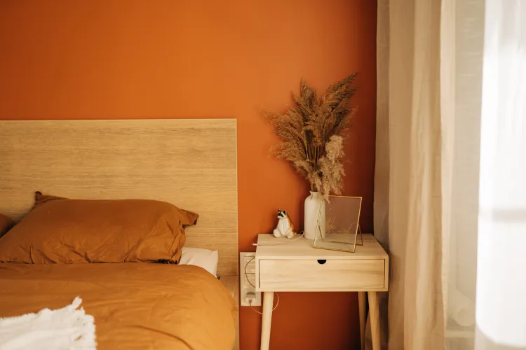
While seemingly inviting, this color can be overpowering. “Its intensity can feel visually loud,” Henriquez explains.
And so, this hue tends to create the optical illusion of making walls seem closer than they are. Thus, rooms in this color feel uncomfortably cramped and over-the-top, rather than vibrant, she says. But the feeling of a room is about more than just a single color.
A stuffy atmosphere often comes down to how a color behaves in the space, so colors like burnt orange that are dark and muddy tend to make a room feel closed off because they soak up too much natural light, she says.
Charcoal Gray
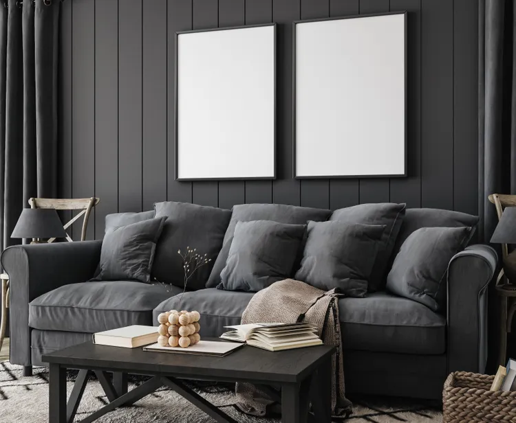
A dull, heavy, and dark gray can definitely make a room feel stuffy. In fact, charcoal gray is a color that seeps the light out of a room and can make it feel overwhelmingly oppressive, says Anna Tatsioni, lead interior designer and architect at Decorilla.
However, it isn’t just the color itself that’s the problem. Sometimes it’s the colors you decorate with charcoal gray that can overwhelm the hue.
“Consider other colors in your room’s palette—for example, dark gray next to neon yellow or brown and red are combinations that will feel garish and stuffy,” she says.
Choosing bright whites or colors complementary to dark gray can make it feel more serene.
Navy Blue
This is another color that pulls in light without dispersing it, says Henriquez.
“Colors that make a room feel bigger and more welcoming have a secret—they reflect light and have a receding quality that makes walls seem to expand,” she explains.
And while navy blue is a pretty shade, helping walls visually expand just isn’t in its toolbox of skills. Instead, reserve this color for large rooms with plenty of natural light.
“In smaller, poorly lit rooms, this color usually has the opposite effect,” adds Tatsioni.