Paint is more than simply an aesthetic choice—it can change the way a room makes you feel. We asked designers to share their picks for the most relaxing paint colors, with tips on which rooms they work best in, and how to complement them with other decor elements to create a tranquil space.
Light Blue
To create a gentle, airy feeling—especially in rooms with limited natural light—interior designer Rebekah Murphy suggests Windy Sky 1639 by Benjamin Moore.
“This soft, misty blue has just enough depth to be interesting without taking over a space,” Murphy says. She suggests pairing a matte or eggshell finish with soft white or ivory trim and complementing with metals like nickel or pewter to elevate bathrooms, sunrooms, and laundry rooms.
Mushroom
Mushroom paint will create a relaxing backdrop in both modern and traditional homes. Murphy recommends Purbeck Stone No. 275 by Farrow & Ball.
“This shade is like the perfect mix of brown and gray with a hint of warmth, so it never feels cold or flat,” she says. “We often use it in bedrooms when you want something softer than white or beige—but still calm and inviting. Pair with aged wood tones and textural fabrics like bouclé or linen.”
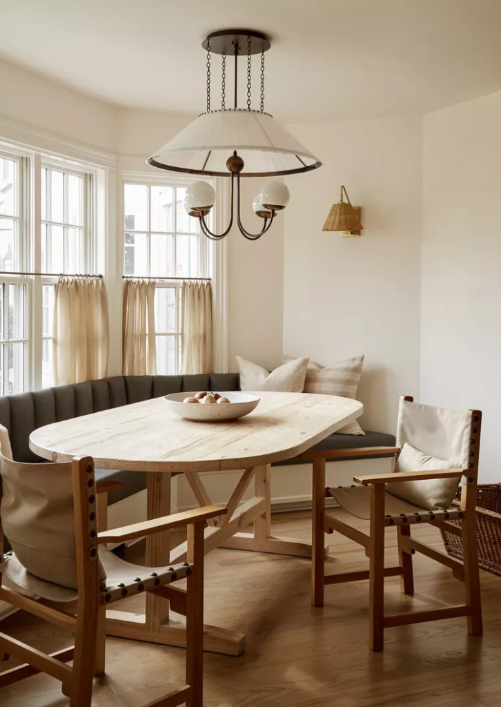
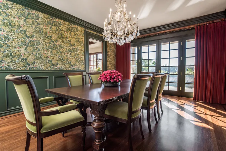
Pastel Green
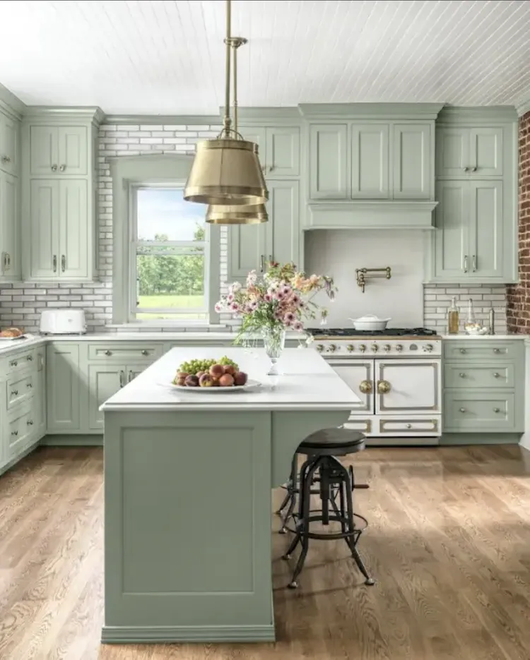
Murphy likes to create a “sophisticated, peaceful vibe” in studies, dining rooms, butlers’ pantries, and kitchens like the one above with Green Whisper by Glidden Diamond.
“It feels timeless and calm without being boring,” Murphy says. “Pair it with natural textures like white oak, aged brass, or unlacquered hardware.”
Off-White
Interior designer Lauren Saab’s go-to color for kitchens and dining rooms is Pointing by Farrow & Ball.
“It brightens a space without feeling harsh or cold,” the designer says of this subtle red-based off-white paint color. “Pointing brings a refined quality that enhances natural light and works beautifully with a variety of textures, creating a timeless look.”
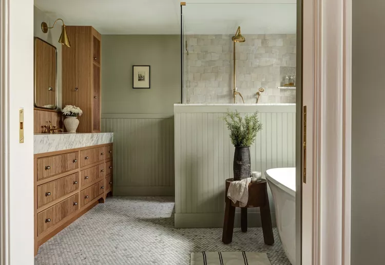
Pale Blue-Gray
Choose a pale shade of blue-gray to evoke the soothing feel of an overcast sky, Saab says.
“I recommend Skylight by Farrow & Ball for bathrooms, bedrooms, and kitchens where you want a spa-like calm,” Saab says. “It works beautifully with natural light and clean lines to create spaces that feel like peaceful retreats.”
Muted Sage
Sage green wall paint brings a noticeable atmosphere of calm to any space, Saab says.
“Vert de Terre by Farrow & Ball is great for bedrooms, entryways, or living areas where a peaceful, restorative mood is essential,” Saab says. “When paired with natural woods, soft linens, and neutral tones, it adds a subtle warmth that feels inviting and comforting.”
Warm White
Choose a warm, creamy white with gentle yellow undertones to create a relaxing feel.
“I love the depth and warmth of Dunn-Edwards Gardenia,” says interior designer Sarah Barnard. “It creates a sense of calm that’s ideal for bedrooms, nurseries, and restorative spaces.”
Forest Green
Darker shades can be equally relaxing, such as the nature-inspired Bavarian Forest by Benjamin Moore.
“With its cool depth and rich, botanical presence, a grounding green invites a sense of quiet strength and contemplation,” Barnard says. “I love this hue for intimate spaces that encourage reflection and connection, such as libraries, dining rooms, home offices, or entryways.”
Chocolate Brown
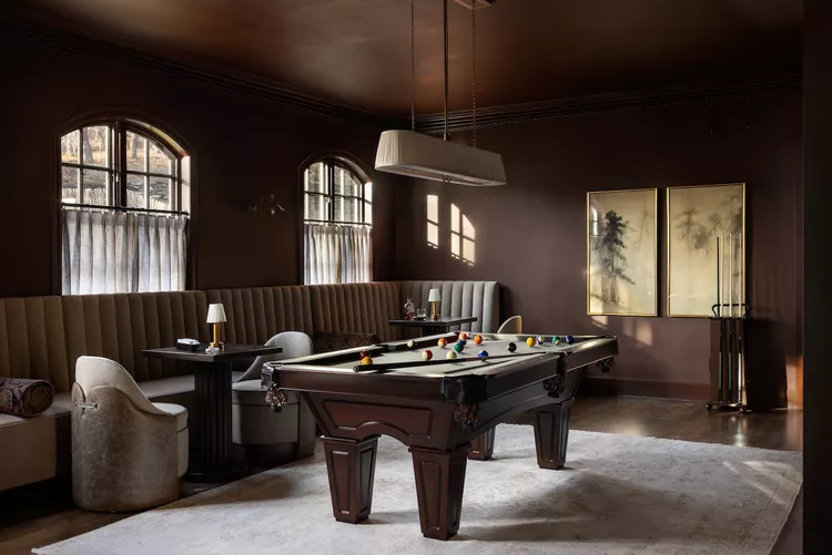
Color-drench a bedroom, TV room, or game room in a rich earth tone shade such as chocolate brown to create a deeply relaxing atmosphere. Paint the walls, window trim, and ceilings for an enveloping feel and accent with lighter tones on window treatments, rugs, and accessories to keep the color from overwhelming.