When it comes to bathroom design, people seem to fall into one of two categories: a neutral, zen space that feels like a spa retreat, or the perfect area in their home to take some design risks.
The one consistent truth is that it doesn’t matter where you fall on the spectrum—everyone is susceptible to picking the wrong paint color.
We decided to check in with a pro designer to find out which are the most commonly regretted bathroom paint colors.
Cool-Toned Blues

According to designer Melanie Grabarkiewicz, the biggest color family she avoids is cool-toned blues that are likely to make both the room and your reflection appear dull.
“Certain shades can be less flattering depending on your skin tone or the amount of natural light in the space,” she says. “Since bathrooms are where you begin and end your day, it’s worth leaning toward warmer, softer tones.”
These warmer colors are the shades that are more likely to flatter your complexion and create a calm and restorative environment, according to Grabarkiewicz.
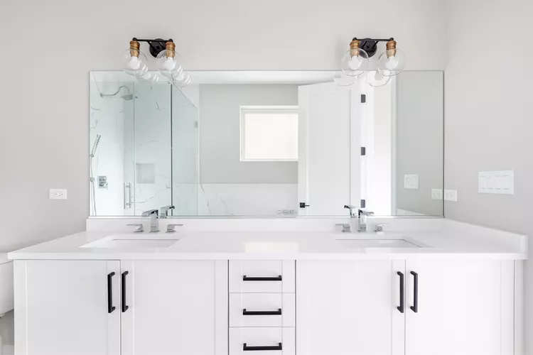
Stark Gray or White
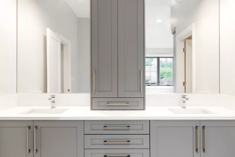
Much like cool-toned blues, Grabarkiewicz says she’s officially over the era of the all-gray bathroom for the same reason—it just looks too clinical. If you’ve been finding your bathroom feels harsh and sterile—especially under cool LED lighting—Grabarkiewicz has some suggestions.
“Warmer neutrals or whites with subtle undertones of cream, taupe, or blush feel far more inviting and pair beautifully with the current shift toward warmer tones in tile and stone,” she says.
Plus, these hues can be easily layered in before you fully commit.
Crisp, Bright White
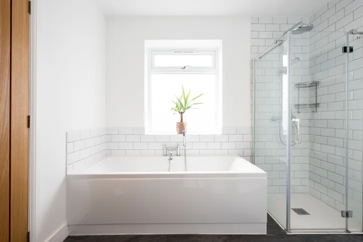
There was a time when Grabarkiewicz expected crisp, bright white walls to work perfectly with a clean bathroom aesthetic. Unfortunately, in practice, she found this pick to be quite stark and unpleasant.
Luckily, she says she was able to fix it quickly by once again swapping in a warmer white. This allowed her to keep the room bright, with sacrificing the end goal of a polished, refined space.
“The bathroom instantly felt more serene and spa-like,” she says.
If you’re struggling with the same problem, any pale neutral with a hint of creme or beige is a great alternative. You can also lean into a blush hue.
“Try introducing a gentle pattern, a hint of color, or even a moody shade like an inky blue or hunter green to bring depth and personality to the space,” Grabarkiewicz says.
Deep Color Drenching
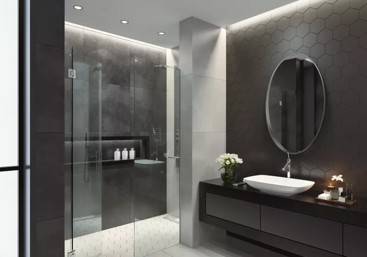
Dark academia had its moment as an aesthetic, and we saw a quick rise of dark, color-drenched bathrooms in deep, moody hues. Unfortunately, this often works better in photos than in real life.
“People tend to underestimate how much—and what kind—of light they’ll need to keep a dark bathroom functional,” she says.
If you’re dying to try a darker room, she says the powder room is a great spot to experiment as long as you work with your light sources.
“Balancing rich tones with well-placed sconces, mirrors, and warm lighting ensures the space still feels inviting and practical rather than heavy or cave-like,” Grabarkiewicz says.
However, if your primary bathroom is the place where you get ready each day, it’s probably not a fit for dark walls.