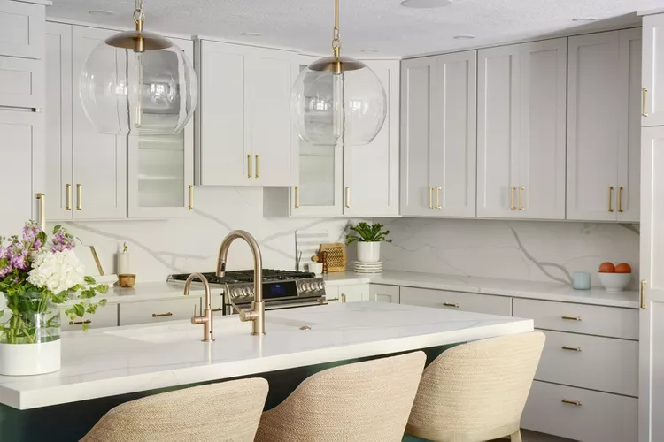
Kitchen trends are constantly changing. But for large projects like painted kitchen cabinets, you want to choose a hue that will stand the test of time (and still be easy on the eye).
To help identify regrettable kitchen cabinet colors, we reached out to interior designers who know which colors that prove disappointing or outdated years later—perhaps these hues are too harsh, too dramatic, or too on trend to be classic.
Bright Red
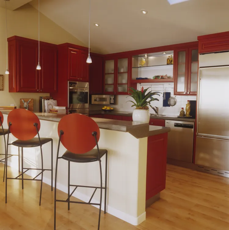
Bold warm colors have recently made their way into the kitchen. But what might start out as a striking, passionate color can eventually overstay its welcome.
“Despite its boldness and energy, bright red can be a difficult color because it can overwhelm a kitchen, quickly become outdated, and grow tiresome,” says designer Evelina Juzėnaitė.
Instead, opt for a rich, muted red, such as Farrow & Ball’s Preference Red No. 297.
“This red is rich and sophisticated rather than loud, adding warmth and drama without overwhelming the room,” she says.
Glossy Black
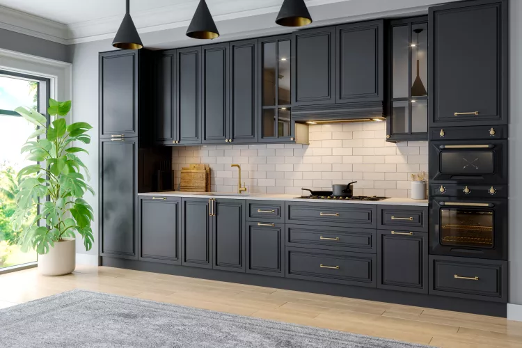
For the last several years, glossy black kitchen cabinets have been all the rage as a contrast to the Millennial white kitchen.
“Black often looks elegant in interior design, but a glossy surface shows everything,” says Juzėnaitė.
Things like fingerprints, dust, and scratches appear writ large on glossy black finishes; they also require a lot of time and effort to keep clean.
Instead, a soft matte charcoal shade like Benjamin Moore’s Onyx 2133-10 creates the same striking, modern look without the high-maintenance shine. It hides imperfections, ages beautifully, and pairs well with most countertop materials.
Pure White
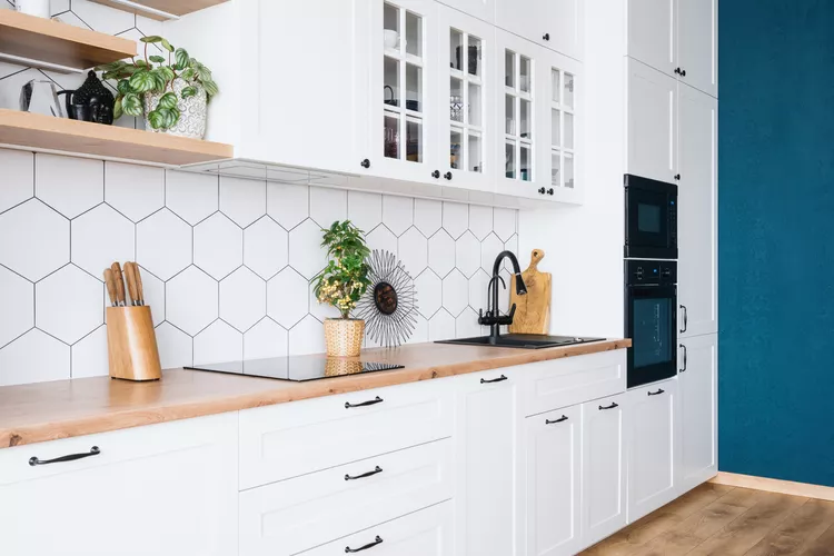
There are some white kitchen ideas that will never go out of style. After all, white is a timeless color that combines well with just about everything. But there is such thing as too white.
“But pure bright white—not cream, not soft white, but pure white—often looks sterile and gets dirty quickly, and can also seem cold and not so cozy,” says Juzėnaitė.
A better alternative to a stark white is a softer shade like Benjamin Moore’s White Dove OC-17. It works great alongside both warm and cool materials, making it incredibly versatile for the kitchen.
“This color has a light, warm tone that looks fresh and timeless, but feels softer, cozier, and simpler,” Juzėnaitė says.
Lime Green
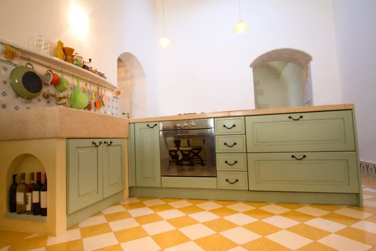
As midcentury modern styles come back into fashion, some homeowners have opted to experiment with atomic era hues like lime green. But lime green quickly becomes visually tiresome.
“It is difficult to combine with many wallpapers, wooden floors, and as trends change, this color tends to become outdated faster than expected,” Juzėnaitė says.
A better alternative is a muted sage green, such as Farrow & Ball’s Vert de Terre No. 234. Sage green kitchens appear more classic than trendy because the color is calming and timeless; it’s easy to pair with a wide range of materials, providing a splash of color without overwhelming the kitchen.
Cool Gray
Gray interiors have been having a moment for the last several years. But a cool grey that skews blue can create a dismal atmosphere, especially in the kitchen.
“In real kitchens, the color makes food and skin tones look a bit sad,” says interior designer Maria Ramirez.
If you still want gray cabinets, choose something like Benjamin Moore’s Classic Gray OC 23 instead, she says.
“It’s a gentle greige that holds warmth without yellowing. It keeps depth, plays nicely with stainless and oak kitchen elements, and feels welcoming morning to night,” Ramirez says.
Dark Gray
“Moody online, gloomy in a north facing room, this color eats light, shows dust and every chip flashes through the dark paint,” Ramirez says.
Instead, she recommends Edward Bulmer’s Saxony. It is a deep, sophisticated shade full of character without blacking out the space.
“The color is beautiful with marble, oiled oak, and aged brass, and it softens rather than hardens a scheme,” she adds.
Pastel Green
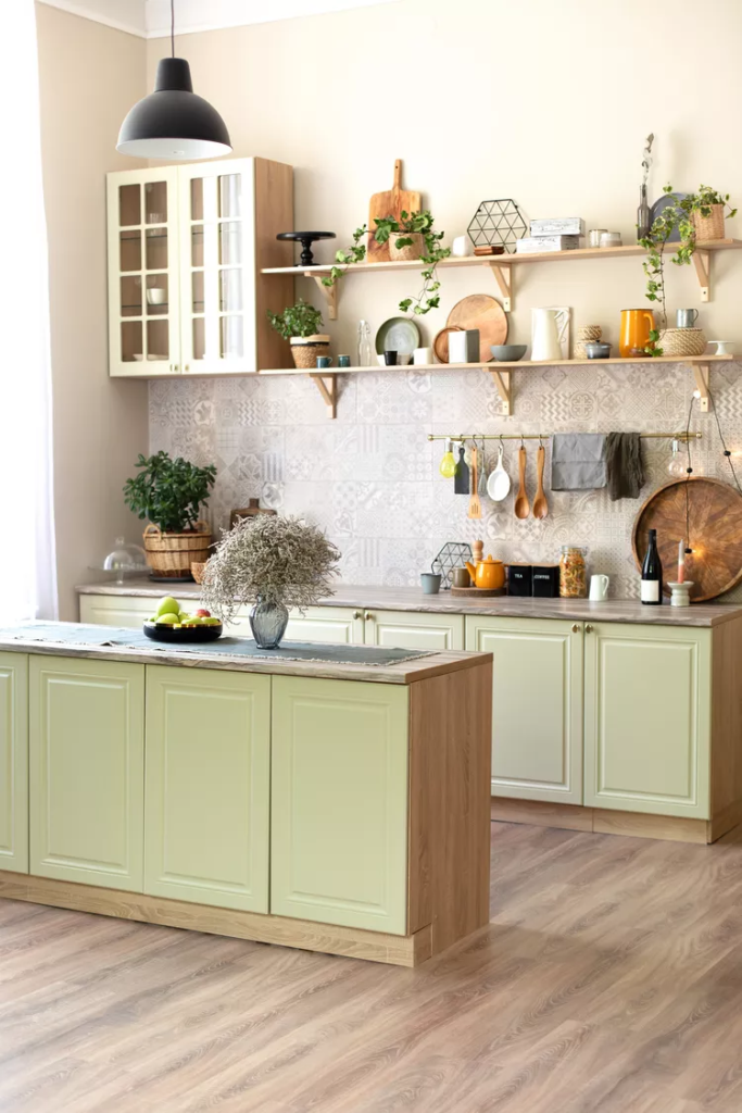
In recent years, green or blue kitchen islands have been used so frequently that they have practically become their own kind of neutral shade. But sugary pastel green shades on cabinets aren’t the way to go.
“Under warm LEDs, it goes into looking like a nursery room and fights with natural stone and wood,” Ramirez says.
Instead, choose COAT’s Good Intentions. It’s a quiet mineral neutral that makes veined stone look richer and hardware more considered.