It might be a sudden aversion or burnout over many years of staring at the same color, but there tends to be a specific handful of paint colors homeowners regret in their living rooms. Every dweller is different, but there’s a clear pattern of shades that don’t serve the walls of these rooms as well as others.
We spoke with three designers who let us know which are the most commonly regretted living room paint colors to help you avoid choosing a color you’ll tire of in a matter of years (or possibly months).
Cool Gray
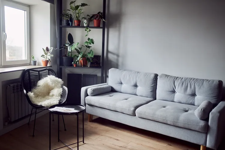
No regrettable paint color list would be complete without cool gray. The once-everywhere, now rebuked shade has lost its charm for a few reasons.
“I think a lot of millennials, in particular, regret choosing flat, cool grays because they can make a living room feel sterile or even gloomy once the furniture and lighting are in place,” says Moszczynski. “What looked sleek on Pinterest often reads lifeless in a real home, especially at night.”
Instead, you may want to opt for a different neutral if it’s warmth and joy you’re after. Moszczynski suggests opting for warm greige or taupe, colors that have brown and beige undertones, which tend to feel more welcoming.
Reds and Oranges
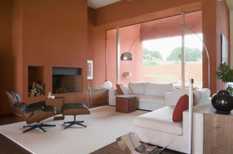
In a room dedicated to socializing and entertaining, a brighter color can be an enticing prospect. You might want to douse the walls in something vivid, but sometimes this can make the room feel too overwhelming.
“These colors symbolize energy and stimulation—great for restaurants, so that guests don’t linger too long, but not for relaxation,” says design and color expert Rona Edelman. “In a living room, these colors can subconsciously trigger anxiety and restlessness, which is why they’re better suited for spaces meant to energize rather than unwind.”
Perhaps you enjoy saturation, in which case Edelman recommends a pale to medium yellow with a touch of gray. This will fulfill that vibrancy you want but give an air of calm. Otherwise, she suggests neutral colors with yellow undertones.
“Both options feel cozy, balanced, and timeless—everything a living room should be,” she says.
Bright Gallery White

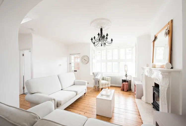
You might be wondering how anyone can get tired of white walls. This is one of the most common options in terms of paint colors, but it’s all in the tone. The wrong one can give the room a slightly unsettling atmosphere.
“Bright gallery style white seems like a safe choice, but in a living room it often feels harsh and too reflective, especially if the space lacks natural light,” Moszczynski says. “People quickly realize it highlights every scuff and seam.”
White isn’t off limits, of course, but rather than a sterile white, Moszczynski recommends picking a softer white. She says that one with creamy undertones is capable of bringing both freshness and warmth into a room.
Dusty Blue
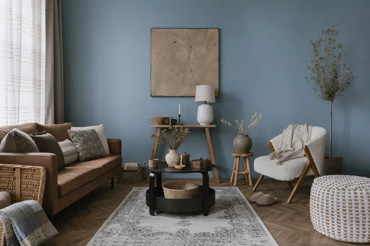
Blue is one of those rare colors that is bold and saturated, but can be just as versatile as a neutral in many design situations. That is, if you choose the right shade of blue. One that homeowners tend to regret is dusty blue—a cooler-toned option that doesn’t scream timeless.
“Colorways with cooler undertones look incredibly dated and one-dimensional,” says interior designer Melissa Roberts. “They can make a space feel cold and sterile as opposed to comforting and inviting, which is something that we should always strive for in a living room.”
Unlike other shades within its family, dusty blue can start to feel stale. As an example, navy, on the other hand, may be dramatic and bold, but it feels sharp and fresh at the same time.
“If you’re still into blues and other neutrals, make sure that they have a warm or red/orange/yellow undertone so that you’re not getting any ‘cool’ shades,” she says.
Yellow
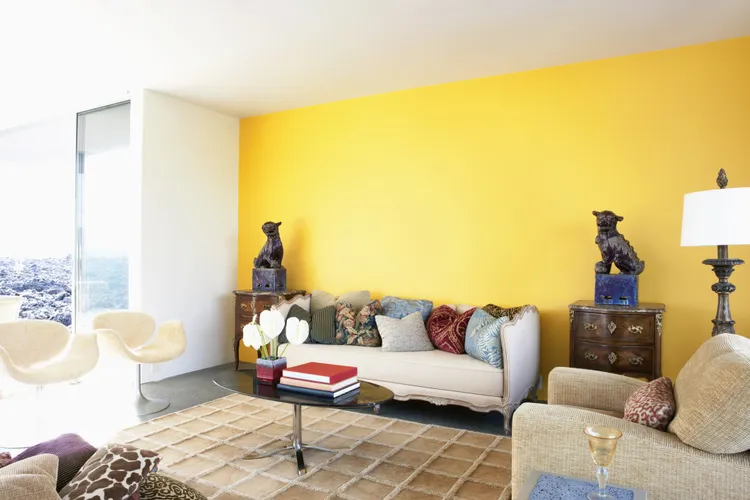
In the same vein as red and orange, yellow is a common color for living rooms that differs from the neutral norm. It’s bright and playful, but after some time, homeowners might start feeling like it’s a lot for the walls.
“Yellow is chosen a lot to make a room happy, but bold, clear yellows tend to read loud and overly intense once applied on a large scale,” says Moszczynski.
Warm colors and tones still give the same ambience without the blaring tone or strange reflections, hence why colors such as brown and earthy tones have been garnering more popularity as of late.
“A softer buttercream, wheat, or muted ochre offers the same warmth without the cartoon-like vibrancy,” she says.
Cool Greige
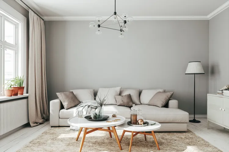
Like gray, greige had a long-lived moment in the spotlight. It was that perfect shade between gray and beige that could look different depending on the light and room. But over time, specific greige shades have lost their popularity.
Roberts says that this is especially true for greiges that have cool undertones. Similar to dusty blue, this color can feel sterile and cold. It leans more bland than it does warm and inviting. Luckily, it’s easy to fix.
She recommends replacing them with warmer colors. Her current favorites include several from Sherwin-Williams’ range, such as Vandyke Brown, Smokehouse, Tony Taupe, Taupe Tone, Mushroom, and Universal Khaki.
