If it’s time to give your living room a fresh coat of paint, you’ll want to choose a modern color with staying power. Avoiding outdated paint colors from the start will help save you from an untimely re-paint (or living with color remorse for years).
To learn more about which outdated living room paint colors to avoid, we sought the expert opinion of two designers. Plus, they also offer alternative options for each.
Charcoal Gray

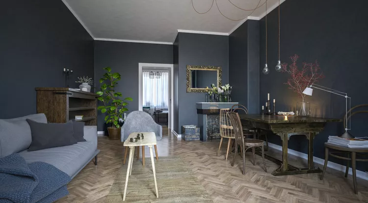
If you want to go with a dark, bold color for your living room, Philip Thomas Vanderford of Studio Thomas James says to steer clear of charcoal gray.
“Charcoal gray was once the go-to for achieving that dramatic, sophisticated look,” he says. “However, it’s become so prevalent in recent years that it now feels expected.”
He’s also against using charcoal as a living room paint color because it can make the space feel too heavy and one-dimensional. This evokes a mood that feels closed-off and stifling.
Try This Instead: Deep Olive Green or Terracotta
When his clients request a dramatic living room color, Vanderford suggests choosing an earthier, more inviting color than charcoal gray. His go-tos are dark olive green or terracotta.
“Both colors create a cozy, sophisticated ambiance with greater warmth and a nod to natural elements, lending depth and interest without the heaviness,” he says.
Navy

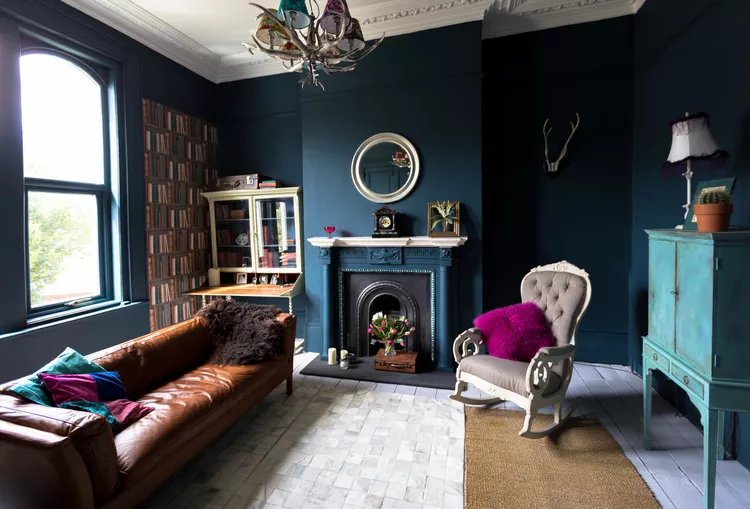
Meghan Kluth of Moment of Kluth Designs cites navy as one hue that’s outdated for a living room wall color. She recalls seeing it countless times in use as an accent wall (another very outdated trend).
Similar to charcoal gray, navy’s dark nature and cool tones don’t make for a very welcoming space. Plus, navy rarely looks good with black, which is an accent color that’s hard to avoid entirely.
Try This Instead: Pale Blue
Kluth’s issue with navy blue doesn’t lie in the fact that it’s a cool tone. In fact, she highly recommends pale blue in a living room setting. Try opting for a dusty blue that looks almost as if it has a bit of a patina to it, especially if you love the French look.
Cool White

If you’ve dipped your toes into the world of white paint, you know that even the most subtle changes in undertones has a dramatic effect on its overall look.
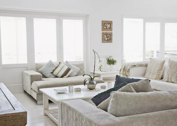
“For years, cool white was the backdrop for modern, minimalist aesthetics, providing a crisp and clean look,” Vanderford says. “But this stark shade can feel clinical, particularly in a space meant for gathering and relaxing. The trend toward warmer, more inviting spaces has made the cool white look feel too austere.”
Try This Instead: Warm, Creamy Off-White
Stark, cool-toned white is often what you see in laboratories or hospital settings, so it’s no wonder that it often feels sterile. However, Vanderford says you don’t have to entirely avoid white as a wall treatment.
Warm, off-white paint with subtle undertones of beige or cream is a great alternative in his book.
“These nuanced tones retain the light and airy feel of white, yet add warmth, softness, and a more welcoming quality to a living room,” he says.
Kluth also cited stark white as a color to avoid and recommends going with warmer neutrals like beige or taupe instead.
Teal

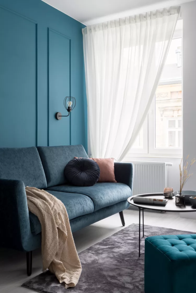
“Teal was the darling of the design world for a time, adding a pop of color that was neither too bold nor too safe,” he notes. “However, it’s now a color often associated with trendy interiors of the early 2010s, giving many spaces a dated appearance.”
Try This Instead: Subdued Sea Green
If you are still deep down a fan of teal, Vanderford recommends trying out another ocean-inspired color for your living room wall treatment.
“Subdued sea green will offer depth and sophistication without the sense of an era-specific trend,” he says.
