Some paint colors become so popular and ubiquitous that they end up making your home look generic and tired. Even yesterday’s go-to neutrals can date a space as decor trends evolve.
We asked designers to name the colors that they have seen enough of, with suggestions about what to try instead.
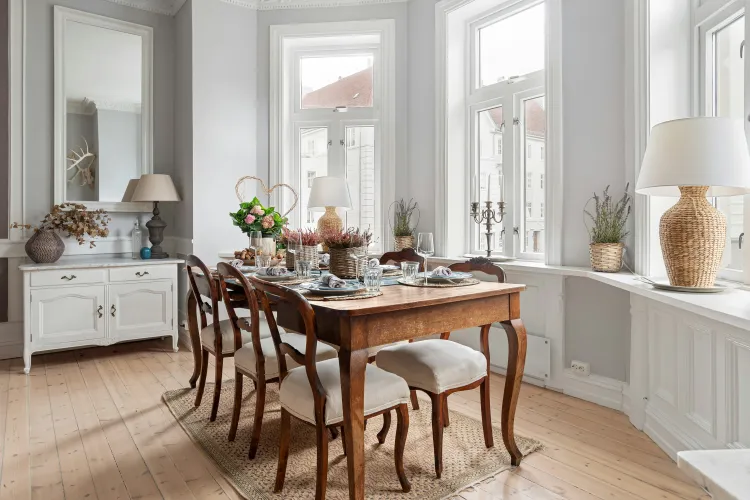
Cold White
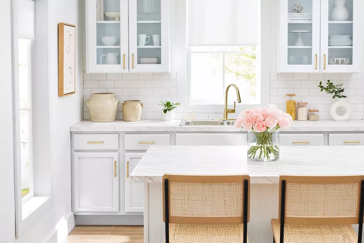
Designers agree that cool-toned white walls lack imagination and can give spaces a basic look.
“White is clean, classic, and makes a space feel big,” says interior designer Tavia Forbes. “But when every wall, ceiling, and trim is the same bright white, it starts to feel more like primer than a design choice.” She suggests trying Benjamin Moore colors Chantilly Lace or Swiss Coffee instead.
“Chantilly Lace is a crisp, gallery-style white that works beautifully with modern decor, while Swiss Coffee has just enough warmth to make a space feel lived-in and soft,” she explains. “These colors are best for kitchens, bathrooms, and light-filled spaces where you want a refined canvas—not a blank one.”
Interior designer Rebekah Murphy notes that “ultra-bright whites can feel sterile and one-dimensional, especially in rooms without strong natural light.” She recommends Benjamin Moore White Dove “for its creamy undertones that add warmth and softness without yellowing.” Try it in kitchens, living rooms, and spaces layered with natural textures and warm metals, she says.
Interior designer Kim Dee suggests trading the overused Sherwin-Williams Extra White for Sherwin-Williams Shoji White.
“Extra White is crisp but can feel cold in certain spaces, especially with natural light shifts,” she says. “Shoji White brings just enough warmth to feel lived-in without looking yellow. This creamy white is cozy and complex, perfect for every room in your home. In kitchens, bathrooms, or on cabinetry it gives the fresh look without the chill.”
Light Greige
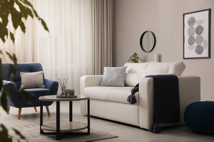
The popular Sherwin-Williams Agreeable Gray—a neutral light greige—was cited by more than one designer as having overstayed its welcome in modern interiors.
“Sherwin-Williams Agreeable Gray has become the default ‘safe’ color, but it can read dull and dated in today’s homes,” Forbes explains. “Repose Gray by Sherwin-Williams is a bit cooler and more refined, while Balboa Mist by Benjamin Moore offers warmth without looking muddy. Both work better with modern finishes and today’s more organic textures.”
Murphy notes that Agreeable Gray “often reads flat or muddy in certain lights, lacking the warmth or character that makes a space feel thoughtful. Farrow & Ball Skimming Stone offers that same versatility with added depth and softness, making it perfect for bedrooms, studies, or anywhere you want a calm yet nuanced backdrop,” she says.
Dee suggests trying Revere Pewter by Benjamin Moore. “It offers a grounded, earthy vibe that feels richer and more current,” she says. “It works beautifully in home offices, family rooms, or any space you want to feel inviting and warm.”
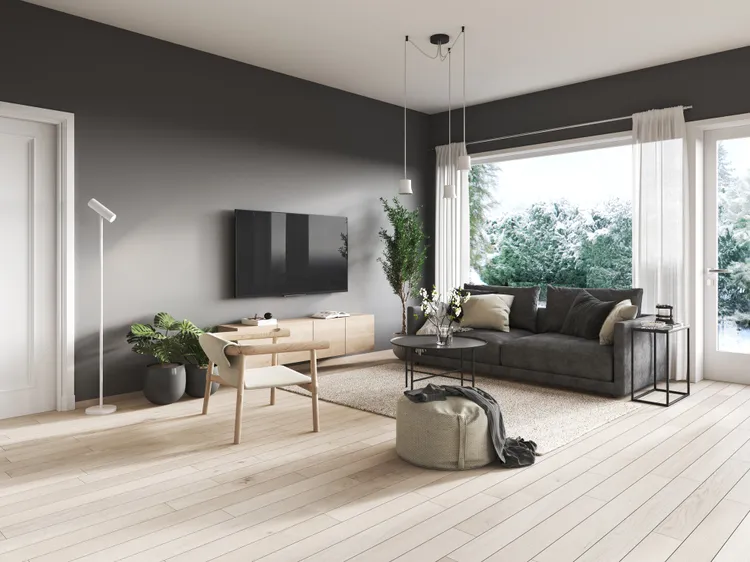
Navy Blue
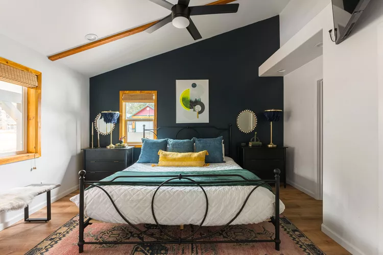
The designers also concur that navy has been overused in recent years on accent walls, kitchen islands, and elsewhere.
“Navy has become the go-to bold-but-not-too bold color,” Forbes says. “It’s dependable—but it’s also predictable.” Instead, she suggests trying deep olive green or charcoal brown.
“Deep olive brings in warmth and earthiness, while charcoal brown feels luxe and grounding, especially when layered with mixed materials,” Forbes explains. “Both offer richness with more edge.”
If you want to stick with blue, Murphy suggests trading a heavy or overly saturated navy with Benjamin Moore Boothbay Gray. “It’s a gentle blue-gray that evokes coastal calmness with subtle moodiness,” she says, “ideal for powder rooms, laundry spaces, or any nook that needs quiet drama.”
When considering kitchen colors, Dee suggests trading overused shades like Sherwin-Williams Hale Navy for newly trendy butter yellows such as Benjamin Moore Sweet Cream. “A slight nod to the past, this color offers a unique light, cozy feel to your kitchen,” she says.
Cool Charcoal Gray
Dee suggests swapping cool charcoal grays like Benjamin Moore Chelsea Gray for shades such as Sherwin-Williams Urbane Bronze.
“Traditional cool grays can feel one-note and dated,” Dee says. “Urbane Bronze delivers depth with warm, moody undertones that feel fresh and dramatic. Used in powder rooms, on built-ins, or for exterior trim, it instantly elevates a space with understated boldness.”
Pale Blue
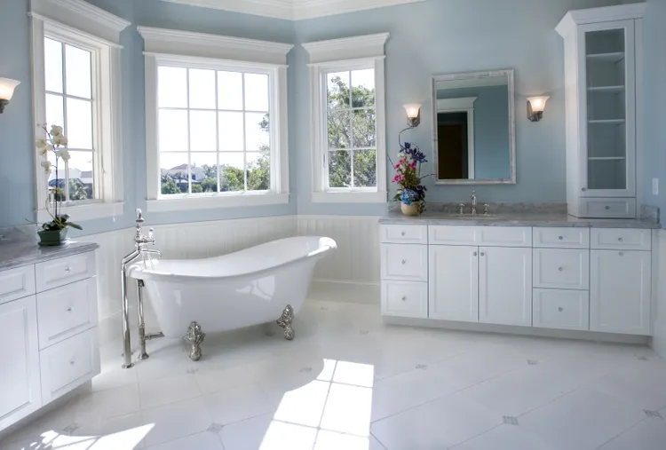
Interior designer Lauren Saab of Saab Studios in Dallas suggests trading “forgettable soft sky blues” with something deeper and more nuanced.
“Pale blues can feel washed-out or overly delicate, especially in more tailored or refined interiors,” the designer says. “Farrow & Ball Hague Blue offers a deeper, more architectural take on blue. It is rich, moody, and elevated—ideal for libraries, entryways, or dining rooms where you want quiet confidence and depth.”