One of the most impactful changes you can make to a room is changing its color. But while paint can work its magic and improve the atmosphere of a space, an outdated color combination can also mess with the balance.
Below, we’ll explore the combinations you can expect to completely fade out come 2026 and these experts’ suggested alternatives.
Yellow and Burgundy
Some color combinations are flashy and eye-catching, but not necessarily suitable for looking at every day in your living space. Combining primary colors and their related shades can often give this feeling which is why burgundy and yellow are on this list.
“Yellow and burgundy is not one of my favorite combos—it usually feels dated,” says interior designer Isabella Patrick. “But with the rise in color drenching and maximalism, there is a way to do almost anything well by choosing the correct shades and applications of color.”
Instead, try toning down the saturation, opting for a pale cream and burgundy, or a similar combination that isn’t quite as jarring.
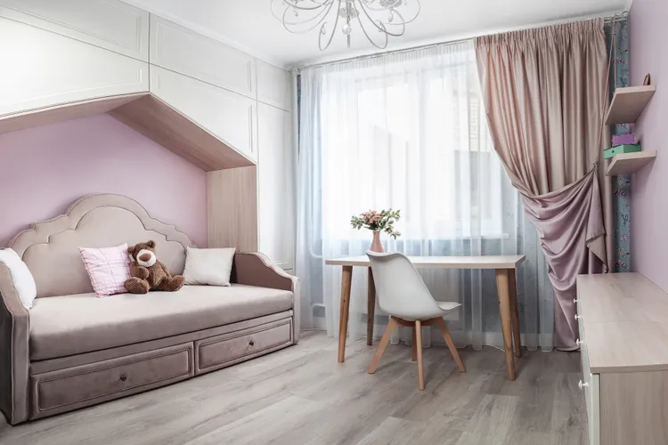
Pink and Lavender

Pairing two pastel hues together, such as pink and lavender, might have an air of whimsy at first, but they begin to feel dated fast.
Colors like these often work well in smaller doses as accents or separate from one another. Even color-drenching with just one of these colors tends to look better than pairing them both together.
“Better alternatives [include] baby pink with cool green accents for a fresh contrast, or pair pink with a bold hot pink for a fun monochromatic direction,” says paint expert Laura Waterson.
Teal and White
Another paint color combination designers avoid is white and teal. In comparison to what’s trending and exciting to dwellers nowadays, this mix is a little too bright and cooler than the shades that many people currently prefer.
“The trend now is all about warmth, depth, and unexpected color combinations,” says interior designer Laura Medicus.
Therefore, it’s often more long-lasting to choose a palette or combination that’s softer and warmer. That doesn’t mean you have to forgo greens and other colors entirely.
“Picture warm whites with fern green and buttery yellow, or rich chocolate browns with soft lavender and pops of chartreuse, or earthy olive paired with deep navy,” she says. “It’s all about creating layers of color that feel inviting, sophisticated, and a little playful.”
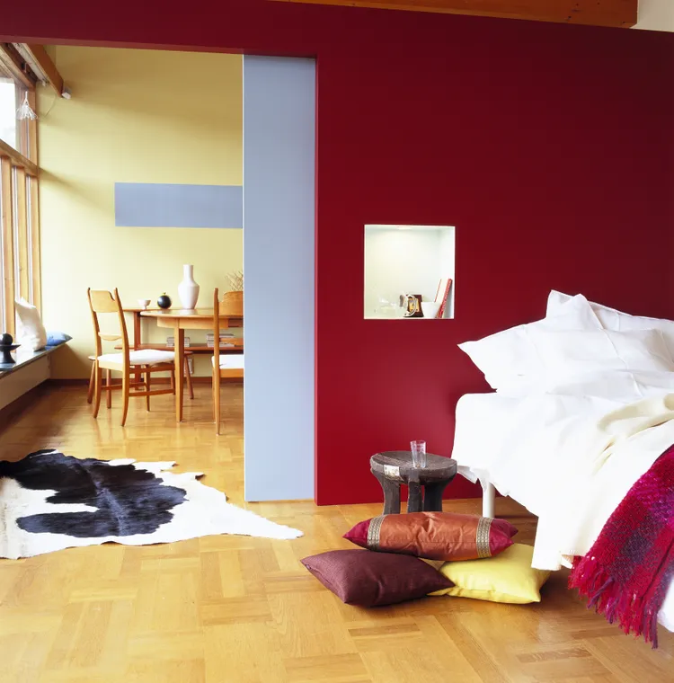
Brown and Burgundy
As we’ve seen, burgundy can be a tricky color to blend with others. That’s why brown and burgundy is another outdated combo design experts would recommend avoiding.
“Paint that accent wall red, but do not put a chocolate brown couch in front of it,” Waterson says. “My suggestion is actually to double down!”
She offered up several examples of how you can do this. If you opted for a bold red in a bathroom or other room, she says to paint the ceiling, not just the walls, for a modern finish.
It’s also smart to choose accessories in the same shade, which completely embraces the color-drenching trend. Lastly, aim for complementary colors to make your walls pop as opposed to a shade that’s also dark but clashes more than it matches.
Greige on Greige

You might think that bright colors and bolder hues would be the most tiresome combinations, but neutrals aren’t safe from feeling dated either. Case in point: One of Waterson’s biggest color pet peeves is greige.
“Grays, off-whites, and beiges have been syphoning off our energy since the 2010s,” she says. “Entire homes were turned into low-energy gray boxes in an attempt to look ‘minimalist,’ and the result was often flat and cold.”
A better alternative? She says to opt for something warmer, such as taupe. Or, if you prefer whites and lighter tones, she says milk white, butter yellow, and ivory all offer a little more warmth.
“Finding the right hue is not so hard as it might seem,” she says. “Other great colors are chartreuse and champagne, warm without screaming ‘yellow’ into your face.”