Pairing multiple colors together in a room is a challenge, whether you’re thinking about wall paint, linens, pillows, or rugs.
Designers often use bold, stunning unexpected color combos successfully in their projects, but they do indeed cite a few color combos as no-gos that just read as tacky and outdated.
Below, three interior designers share the color combos that look tacky today—plus offer modern alternatives.
Black and White
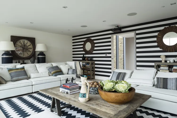
Black and white is a classic color combo (even beyond exteriors), but there are instances when it doesn’t work in design. Overly bold graphics in black and white can read dated, and interior designer Audrey Scheck says it can be bad in ultra-contemprary, minimalist spaces, too.
It can “quickly feel harsh and visually flat,” she says, “All black and white interiors often lack the warmth and depth that make a home feel inviting.”
As an alternative, she recommends weaving in a mixture of soft neutrals and warm tones to ensure that a space appears balanced.
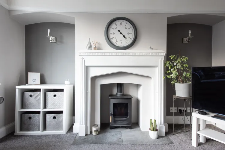
Gray and White
In addition to not being a major proponent of black and white, Scheck isn’t a fan of going all in with gray and white, either. This combination “can feel uninspired when used without contrast or warmth,” she says, citing gray’s cool tones and white’s brightness as factors that can make a room look sterile.
Again, she recommends going warm when possible instead, embracing richer neutrals.
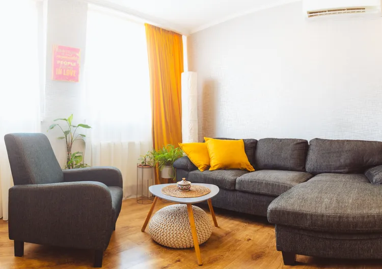
Brown and Red
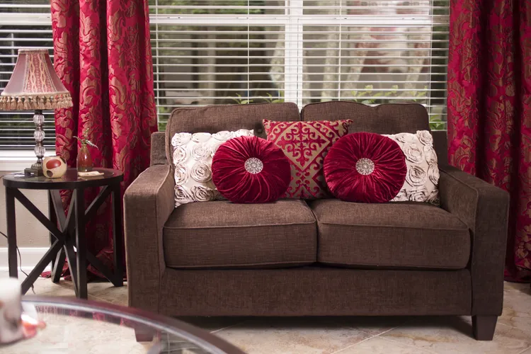
An additional color combination that Scheck would recommend avoiding is a brown and red pairing. “Both are strong, dominant colors,” she says. “When used heavily together, they can easily overwhelm a space.”
As an alternative, focus on using just one of these colors at a time. Scheck notes that red makes for a wonderful accent color that can be woven into patterns or smaller elements of a room, while brown looks nice paired with softer tones.
Gray and Yellow
As you consider colors to pair together in your home, think about timeless color combos.
In interior designer Michelle Gage’s view, gray and yellow reads as a tacky color combination because it feels too time-specific.
“It feels very 2014,” she says. “Never do anything that feels too much ‘of a certain time.'”
Pink and Gray or Pink and Black
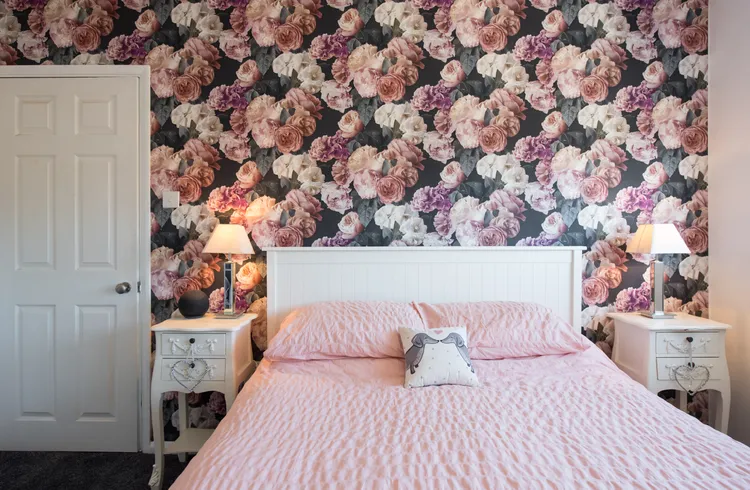
Speaking of the 2010s, remember when pink and gray was all the rag? “Pink and gray had a very real moment in the early 2010s, right alongside chevron prints, gallery walls with word art, and mason jars used as lighting fixtures,” says color consultant Katie Webster.
Webster notes that what felt on-trend and aesthetically pleasing at that point in time now just feels “overly literal and juvenile.”
She isn’t alone in this view. Pink and black, a similar color pairing, is one that Gage urges steering clear of in this day and age. It’s much too trendy, she explains, adding that it calls to mind a teen room in 2006.
If you love any of the colors above, pick one to embrace fully for a more contemporary look. (Color drenching, anyone?)