Interiors may be personal, but some paint colors are just so good that designers come back to them over and over again. The same shade might give a different space a different feel, and we wanted to know which ones designers can’t step away from.
If you’re curious what they are, we asked three interior designers what their favorite paints are, plus the exact brands they source them from so you can curate a beautiful home.
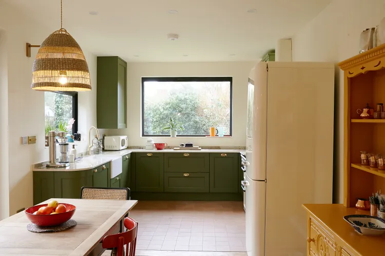
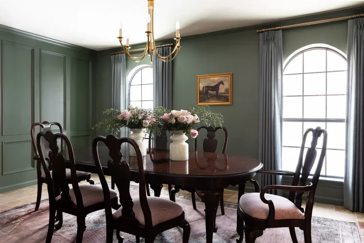
Dark Green
Starting off with an unexpected but strong contender: dark green. Interior designer Craig Gritzen notes that Studio Green by Farrow and Ball is his go-to.
“I keep coming back to this color because it makes spaces feel tailored and luxe,” he explains. “This saturated green makes artwork pop and works well with brass and natural wood tones.”
He suggests trying it in offices, studies, or areas that would benefit from moody colors, like a reading nook.
Warm Cream
For interior designer Charlotte Broadribb, Little Greene’s First Light is a personal favorite.
“It has a positivity and optimism to it, like the first light of dawn,” she says.
This soft cream color with a yellow tinge has a natural daylight look to it, and it’s a great choice if you’re looking for a calming hue to color-drench a room.
Try it in a breakfast nook, living room, or bedroom for a fresh morning feeling, all of the time.
Rich Maroon
While whites and neutrals are undeniably easy to incorporate, maroon is a fantastic alternative if it’s depth and dimension you’re after.
“This tone falls in the ‘color-that-isn’t-a-color’ category of designer staples,” says interior designer Elizabeth Ryan. “I love how maroon can make a space appear like it has been here for decades but remains fresh.”
She recommends Farrow & Ball’s Preference Red or Sherwin-Williams’ Rojo Marrón. These shades are velvety and surprisingly versatile—try them in a dining room, home office, or bar area.
Gray-Green
When you want a color other than a neutral that still serves as a chic backdrop, look to gray-green shades.
“It’s the perfect wall color for rich furnishings because it is so complementary, not demanding,” Ryan says.
She points to Sherwin-Williams’ Evergreen Fog and Farrow & Ball’s Treron as two fail-proof choices. They work great in dining rooms, kitchens, and bathrooms.
Black
The boldness of black makes it both a great foundation for cozy spaces and an accent shade for features like trim and fireplace surrounds.
Sherwin-Williams’ Tricorn Black is a classic option, and one of Gritzen’s preferred colors. He also likes pairing it with other shades, such as Benjamin Moore’s Cinnamon Slate.
“The black gives structure and contrast against the softness and depth of Cinnamon Slate with a result that feels elevated and not stark,” he says.
Try it in a dramatic dining room, kitchen, or bathroom.
Taupe
You might scoff at taupe and its predictability, but it’s worth giving it a chance, especially when paired with other colors and finishes.
“That sounds so boring, but trust—a taupe ceiling with rich, vibrant walls or glossy taupe paneling truly adds a layer of sophistication to a space,” says Ryan.
Need a suggestion? Ryan’s firm most often uses Sherwin-Williams’ Loggia, which is perfect for a bedroom, living room, kitchen, or bathroom.
Warm Pink
“Using color psychology, I’ve specifically designed bedrooms using calming, grounding shades that bring serenity, which are physically soothing for an amazing night’s sleep,” says Broadribb.
For her, the color that excels in doing this is a warm pink. It’s slightly more colorful and fun than beige, but is still just as relaxing; this makes it great for bedrooms, kitchens, and bathrooms.
She always comes back to Farrow & Ball’s Setting Plaster or Little Greene’s Tuscany.