The holiday season brings plenty of hosting, which means it’s never been more important to have your dining room in tip-top shape. Beyond the right dinnerware, seasonal decor, and (never quite enough) seating, there’s another detail worth considering: your wall color. Ideally, the dining room wall color should quietly support the atmosphere—not compete with it.
However, there are a few color choices that designers say are sure to draw attention—and not the kind you want. If your walls are sporting any of these controversial shades, a fresh paint job may be in order. According to design pros, here are seven tacky dining room wall colors your guests will notice right away.
Cherry Red
All three designers we spoke to agreed: bright cherry red is never a good fit for dining room walls.
“Nothing raises people’s blood pressure quite like the color of bright red,” says Lindsay Thornton, founder of the Toronto-based architecture, design, and build firm Cornerstone Custom Build. “While it is a fun color on a front door, when the whole room is bathed in blood, chances are your guests will be on edge,”
While vibrant cherry red may be off the table, you don’t need to avoid this classic hue altogether. If you want red, designers recommend choosing a deeper, more grounding shade.
Consider shades like wine, merlot, or oxblood, says Philip Thomas Vanderford, owner and founder of Studio Thomas James. Alternatively, consider featuring cherry red through decor rather than paint if you’re really attached to the shade.
Bright White
Swinging to the opposite end of the spectrum, designer Mugdha Girish Uma says bright white is also on her no-go list for the dining room. Often viewed as “safe” and timeless, it’s a common choice for those seeking a clean, minimalist, and sophisticated look.
However, designers say this stark neutral can often have the opposite effect, reading as sterile, cold, and uninviting, with a showroom-esque quality that lacks warmth and a lived-in feel.
Nobody tell Pantone, but this paint color is officially out for 2026 in the dining room.
Sharp Yellows
Sharp, vibrant yellows are also a major design faux pas on dining room walls.
“[They] might look cheerful in theory, but they rarely behave well on the wall,” Vanderford says. “At night, they become glaring and unflattering.”
This includes acid neons, electric yellows, and even saturated primary yellows. However, like red, you don’t need to avoid yellow altogether in the dining room.
Sticking to more muted tones is key to creating a space that feels cheerful, warm, and relaxing. Vanderford says that soft shades of ochre or muted golden yellows are his go-to.
Icy Blues
Dining rooms should feel warm, inviting, and comfortable—qualities that cool, icy shades of blue do not embody.
“Icy blues rarely set the right tone for dining,” Vanderford says. “They feel cold and a bit dated.”
That said, blue remains a classic dining room wall color. The trick is choosing the right shade. Right now, warm, earthy blues have designers’ hearts, alongside muted blue-gray tones. These shades will bring the calming energy of blue with far more depth and ambiance than icy blues ever could.
Neon Anything
With bright red, blue, and yellow already on designers’ hit list, it’s no surprise they avoid neon colors altogether on dining room walls. This includes green, pink, purple, and any other shade that could be mistaken for your favorite highlighter.
While these colors can be fun as accents, they can quickly overwhelm a room when used on the walls, lending a frenetic, unsettled feel to a space. Playrooms, home gyms, or music rooms are better places to experiment with these zesty shades.
Teal
Teal and turquoise had their moment in interior design, but designers agree that moment has officially passed. Today, these shades feel artificial and overdone, especially when used as the room’s backdrop.
“The industry is just done and dusted with this color, as we’ve seen enough of it,” Girish Uma says. “Not only is this color slightly difficult to work with, but the undertones of blue and green independently would make a better choice for the dining room.”
Designers now favor earthier shades that feel as though they could really occur in nature. Try a muted green with blue undertones, or a soft blue with green undertones for a more modern take on the teal/turquoise look.
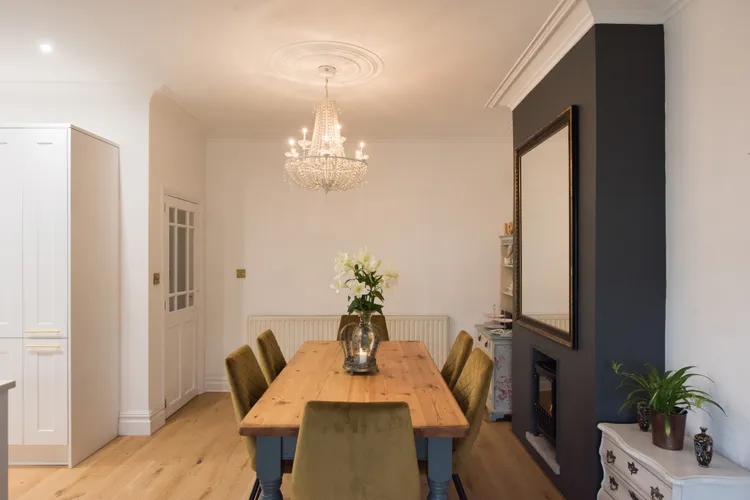
Gray
Oh, gray. This shade has a long and complicated history in the world of interior design, and while it will never truly go out of style, designers are tired of seeing walls painted in lifeless shades of gray.
“Gray is a color tone that immediately sucks the life out of any place,” Girish Uma says. “If it’s used correctly in an apt proportion, like decor, table mats, or even dinner plates, it looks nice, but to paint entire walls in grey is a hard pass.”
Especially in a room meant for gathering, like the dining room, gray does nothing to invoke feelings of warmth and togetherness that will make your guests want to linger (or maybe, that’s the point?).