Choosing a floor color is trickier than it seems. Floors set the tone for a room, and with so many shades to choose from—and no easy “undo” like with paint—it’s easy to feel overwhelmed. Luckily, some colors are instant passes. We asked a design-savvy pro which shades consistently make a space feel dated or tacky. Here are the six she always tells clients to skip.
Weathered Gray
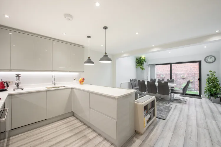
Back in the 2010s, gray laminate flooring was everywhere. Its budget-friendly, weathered-wood look fit right in with farmhouse-style interiors and it offered a modern contrast to the rich, warm woods that predated it.
But interior designer Brittny Button cautions that gray can be tricky in most spaces. Its cool, muted tones wash out deep, rich shades, and the subtle ombré effect combined with repeating patterns can make the floor look noticeably artificial.
“Gray vinyl faux wood planks just read as cheap and can warp slightly when you walk on them,” Button says.
Instead of gray, try lime-washed or bleached wood planks. They’ll give your space a light-colored base without the blah factor.
Glossy White

Glossy white floors may look striking at first, but their ultra-slick, uniform finish leaves nowhere for dirt to hide. Every crumb, spill, or smudge is on full display, turning your floors into a highlight reel of grime.
Instead, Button suggests choosing flooring options in softer cream tones with subtle texture, such as plaster-inspired finishes or delicate faux-marble veining. These finishes will add depth while disguising imperfections.
Button says it’s the ultimate recipe for keeping your space looking polished.
Shades of Black

Ultra-dark floors in shades of ebony or charcoal might seem like they’ll camouflage dirt, but Button warns otherwise.
“Deep chocolate brown or black floors show every stray hair, fabric fiber, and speck of dust,” she says.
For those drawn to dramatic, dark flooring, there’s no need to abandon it altogether. Instead, consider backing up just a few shades. Walnut floors provide a dark base, but come with a more visible grain that helps to cleverly hide light-colored dust.
Cherry Wood
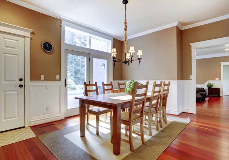
Cherry wood floors can feel like an easy win for warmth, but those rich red undertones often dominate a room’s palette according to designers like Button.
One key reason is that red is a bold hue that doesn’t always harmonize with today’s popular colors, including jewel tones like navy, rust, or burgundy.
More often than not, it seems like the only color it gets along with is cream. Cherry floors feel right at home in traditional or colonial-style spaces, but pairing them with sleek, modern furniture can start to feel less cohesive.
For this reason, most designers encourage that homeowners stick with traditional brown wood options.
Orange-Toned Oak
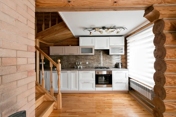
Just as oak cabinets have slipped out of style, so have amber oak floors. The challenge with oak flooring is its orange-leaning undertones, which rarely work with today’s popular moody paint colors.
At its worst, golden oak can feel like a generic, builder-grade floor. It rarely reads as a deliberate choice and more like something that came with your house.
Yellow Pine

Sand-colored floors can brighten a room, but lean too far yellow and you’re venturing into knotty pine territory, which most pros call a no-go.
The issue is that yellow-toned wood casts a yellow glow onto everything nearby, and that kind of underglow isn’t always flattering.
Whites can look creamy to the point of feeling dingy and cooler shades like gray or blue can appear muted or slightly green, almost like viewing your living room through sunglasses.
