
Paint is one of the simplest and most inexpensive ways to transform a room, but it’s also one of the easiest to misjudge.
While fun, bold colors can be tempting to experiment with, they can also be overstimulating when not done right. When picking out a color, designers suggest thinking about how a color makes you feel in the space, not just how it looks on a swatch.
If you’re planning a room refresh, designers suggest avoiding the shades below based on what shades people regret the most and why.
Bright Red
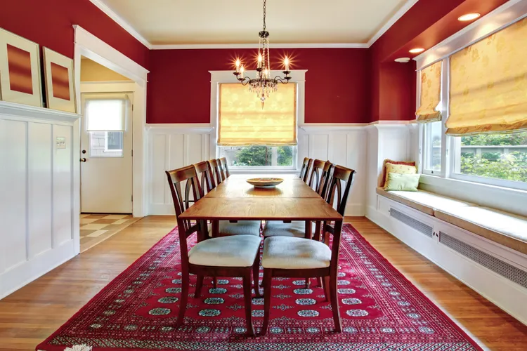
Red can make a powerful statement, but it can also be one of the most common colors people regret choosing as an interior paint color.
“Bright red is a color most people will regret, especially when on a large surface,” Isfira Jensen, CEO and principal designer at Jensen & Co Interiors, says. “It’s bold, but it can also be aggressive and overwhelming in a space.”
Rather than energizing a room positively, red often promotes restlessness and tension. This is especially a problem in rooms meant for relaxation, like a bedroom or living area.
Terri Brien, owner and principal designer at Terri Brien Interiors, notes that red is “linked to energy and even tension, which is the opposite of what you want when trying to relax or fall asleep.”
If you love red, consider using it in smaller doses instead of on walls like through furnishings and accent pieces.
Rusty Orange
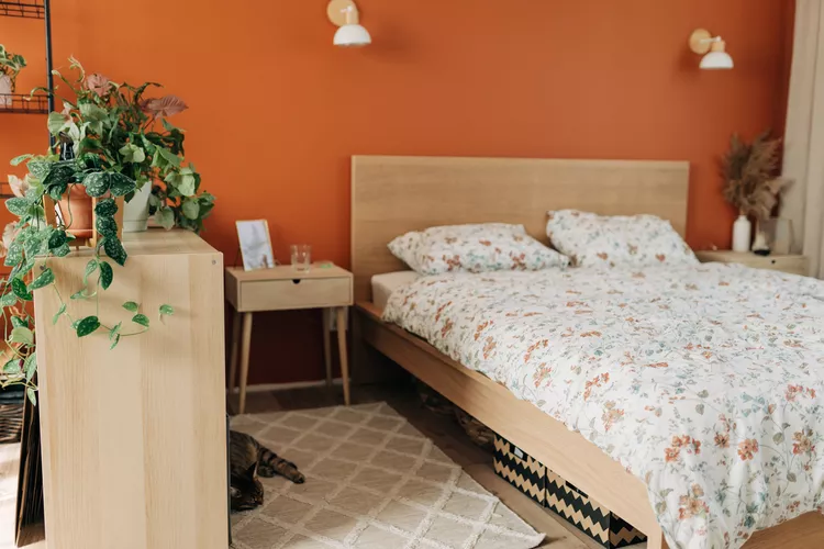
Choosing earthy tones can add a calming look to a room, but rusty orange is one that designers say can be too much as an interior wall color.
“It’s an earthy color in theory,” Jensen explained, “but on the walls it lends itself to feeling too heavy and dated.”
Rather than making a room feel warm and cozy, orange can make a space feel closed in and hard to decorate around. Its intensity can clash with other colors and textures, limiting the design of the rest of the room.
If you’re drawn to warmer tones, consider a softer tone like terracotta or peachy neutrals that offer a similar look without the harshness.
Black

Black walls can look dramatic and chic in photos, but in real life, they’re often more trouble than they’re worth.
“It’s a bold choice, but very few people keep it long term,” Jensen said. “It absorbs light, shows every bit of dust and fingerprints, and makes the space feel smaller.”
While black can work in small doses or in spacious rooms with plenty of natural light, it’s rarely a good fit for everyday living areas.
The maintenance of keeping the walls clean and free of scuff marks can be a deterrent for most people. If you like the idea of black walls, opt for charcoal or navy instead because it’s more forgiving of everyday wear and tear.
Sunshine Yellow
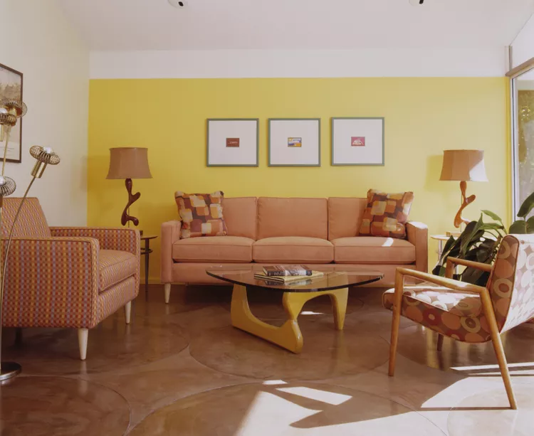
Yellow is often associated with happiness and energy, which makes it a popular choice for kitchens and playrooms. But it’s not a hue that works for every type of space, specifically bedrooms.
“Yellow tends to stimulate hunger and activity,” Brien said. “It can feel cheerful in kitchens or playrooms, but in a bedroom, it has the potential to keep your brain switched on instead of calming down.”
Even though sunshine yellow is associated with cheerfulness, it’s also bright and intense, which can make it hard to unwind. If you love yellow, opt for muted tones like buttercream or soft gold, which offer warmth without the overstimulation.
Neon and Overly Bright Colors
Neon shades and overly bright colors might be fun in theory, but they rarely translate well to interior walls.
“As a general rule, I’d avoid overly bright or neon colors (especially) in a bedroom,” Brien advised. “Shades like fuchsia, hot pink, bright orange, and lime green all fall into this category.”
These colors create too much energy, making a bedroom feel lively and loud when it should feel restful and quiet. Even if you’re designing a space for a child or teen, consider toned-down versions of these hues.
“Softer, muted tones of those same colors can sometimes work,” Brien adds, “but in their pure bright form they usually make it harder to relax.”